Redesigning Adonit’s most top selling product that provides accessibility to navigate, draw, and annotate all on the iPad was a great opportunity in the mobile electronics category. The task was outlined as followed: take some our findings and knowledge from the original product, explore new features to build onto it and improve the overall user experience and value.
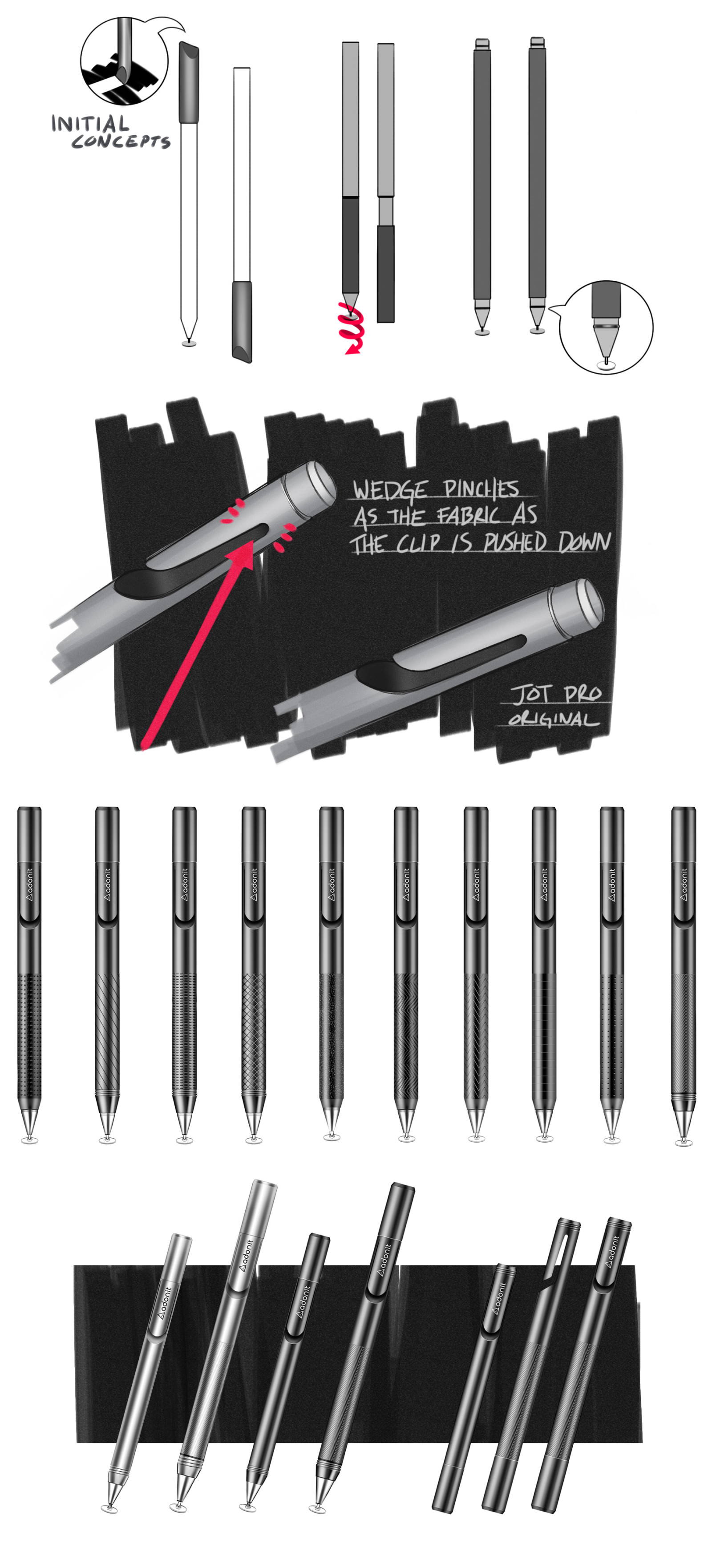
The initial concept phase began by exploring new ideas far out and beyond the expectations of the stylus while still remaining in scope. Later I developed ideas that focused on separate areas of the stylus such as the clip, grip, and the protective cap while occasionally taking a step back to have a more broad overview of the explorations.
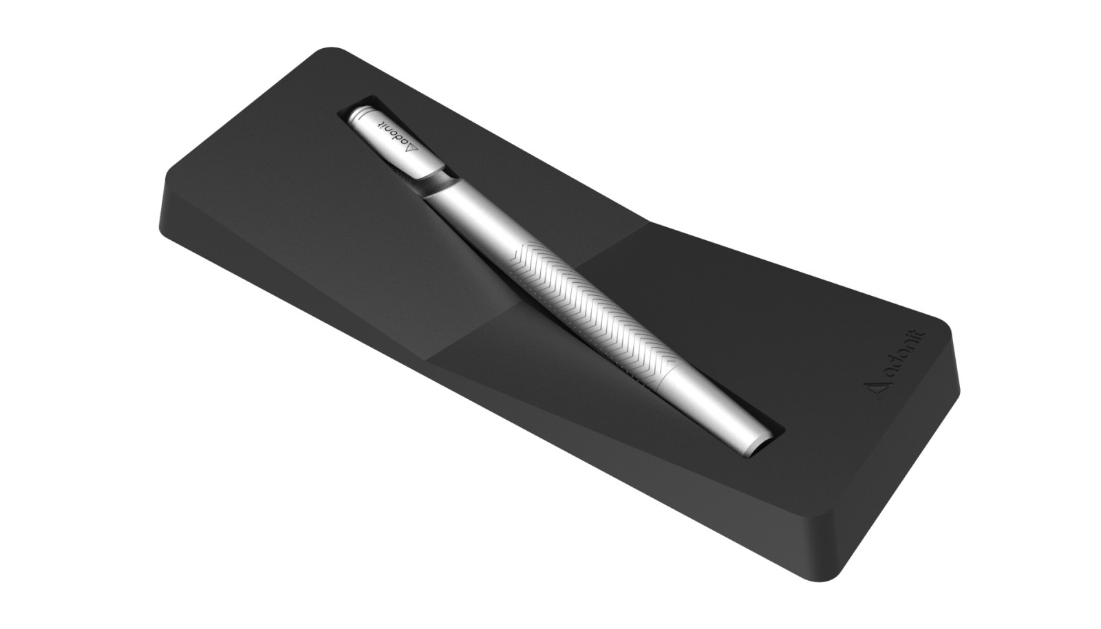
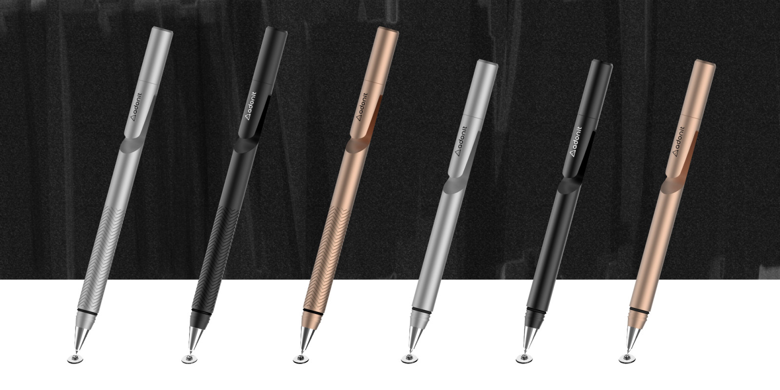
As the design evolved and became more refined, so did the level of details. Explorations on pattern, color, and fine details that hint at Adonit visual design cues were a part of the next step. Adonit’s newly directed color palate was to focus on colors that pull inherently within metals to provide that sense of honesty and maturity that push the overall perceived quality of the product. Later explorations of pattern were inspired by menswear fashion of tweed, polkadots, and herringbone.